
Light Through the Crucifixion
And Further Impressions of the Descent

These are slide images taken in the quiet of my living room window — a patchwork of my father’s studies on the crucifixion and descent. I’ve used daylight and white copy paper to filter the world outside. What you see is distorted — my phone’s reflection ghosted onto the surface of these slides — but maybe that distortion belongs here.
I’ve written before about the fractured state of this collection, the makeshift ways in which I have to preserve William Mix’s work. What remains is a conversation: between copies and originals, masterworks and tributes, faith and fatigue, father and daughter.
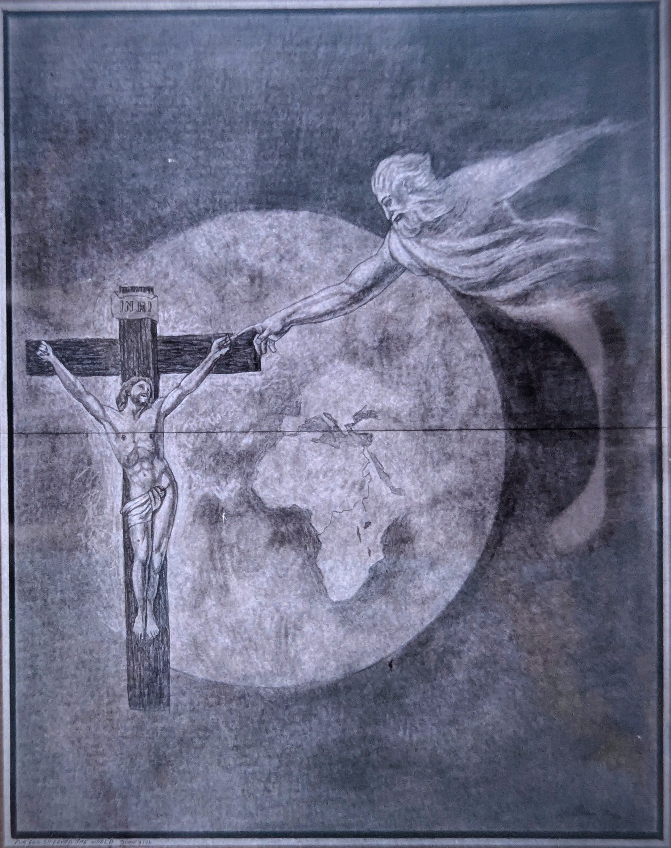
1. "This is My Son" — graphite on paper by William Mix, January 1999
A drawing suspended in space. Jesus, crucified with arms nailed upward. From the right, a fatherly spirit reaches out in the same gesture as God in Michelangelo’s Creation of Adam. The same profile, same flowing hair. Between them, the planet Earth shows Africa most clearly.
A celestial moment. Stillness in deep space.
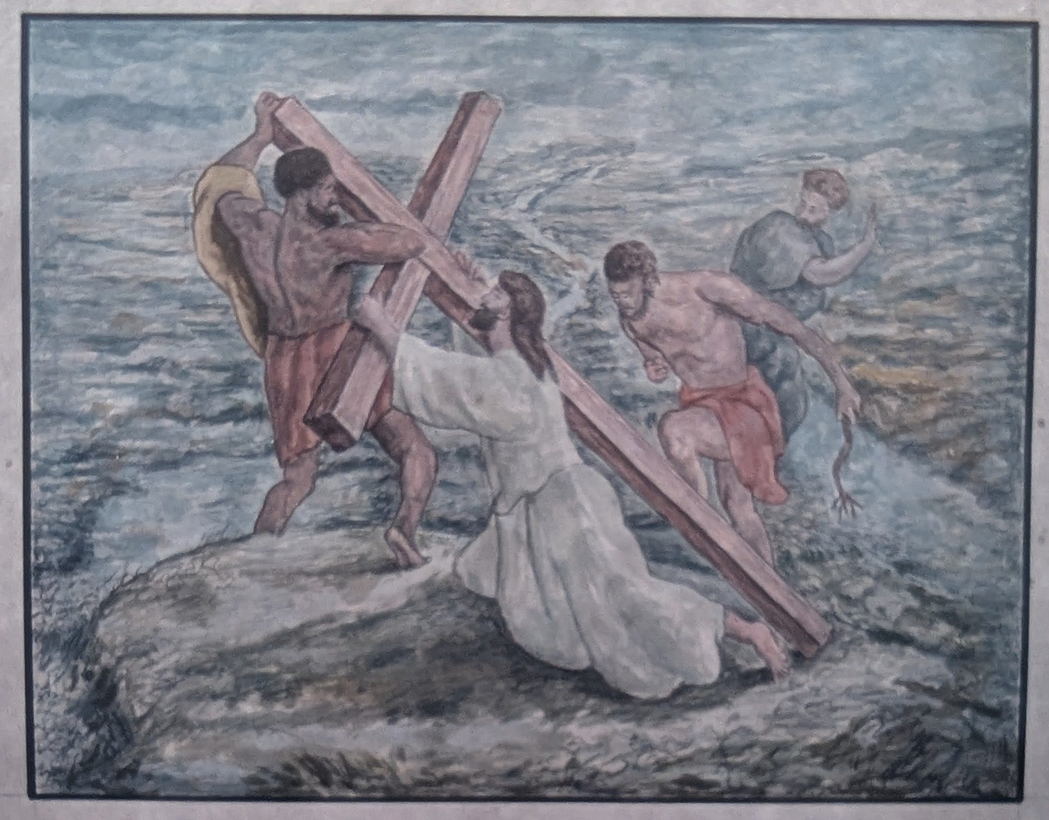
2 & 3. Simon Helps with the Cross — graphite on paper and watercolor on canvas.
Simon is Black. Strong, weighted, and central. Both of these pieces are after Gustav Doré’s Jesus Falling Under the Cross. Below is also Doré’s illustration/engraving for reference.
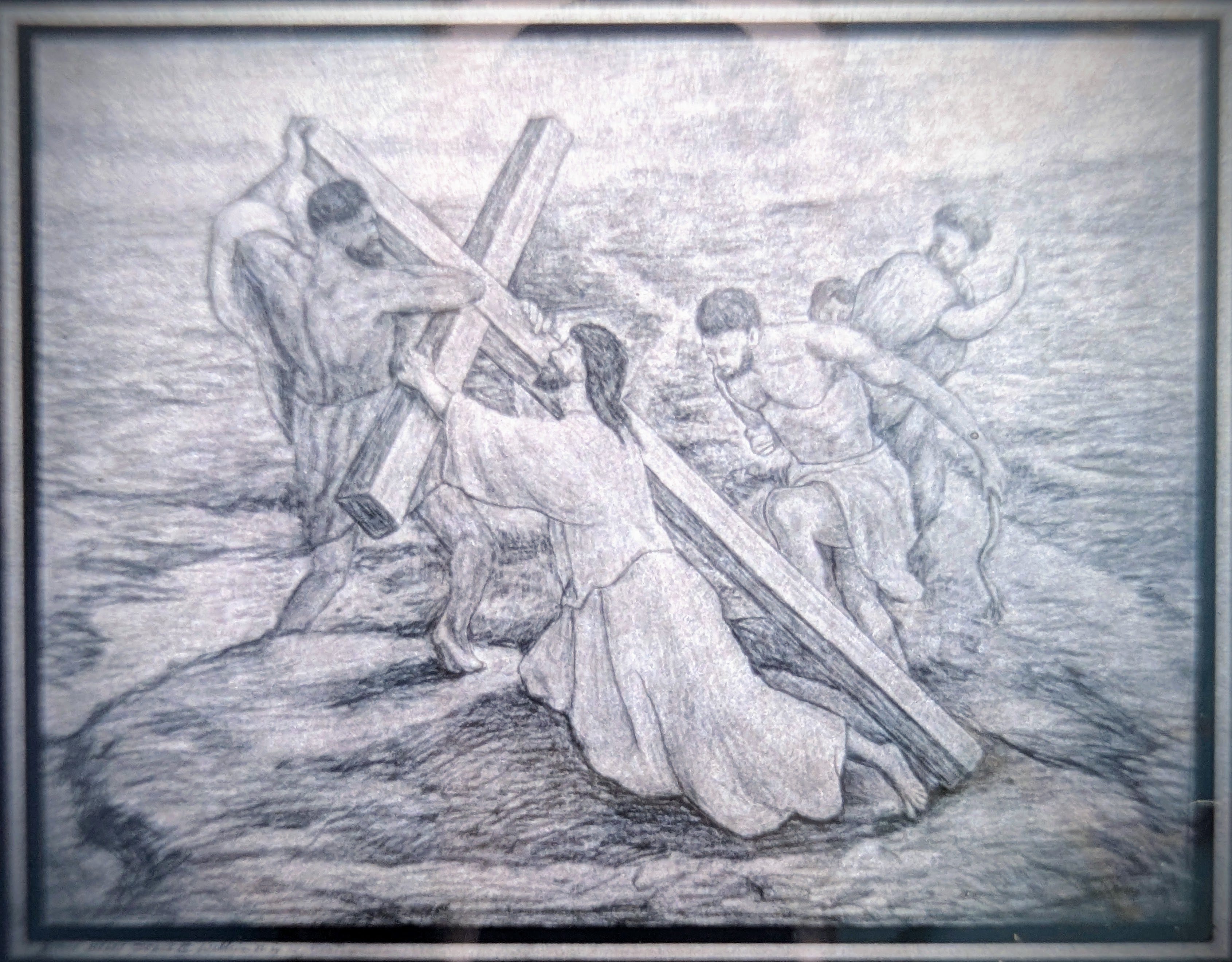
Below is the only painting my father ever marked that his medium was, “Watercolor.” His preferred medium was oil paint. After a decade or so of creating with oils in an unventilated room, it was time for him to make the switch to acrylic, but I recall he seemed to use the paint as thickly as he might use oil.
If a piece was done in acrylic, he would usually notate that the medium as that exact word only: “Acrylic on Canvas,” or, “Acrylic on Panel.” The fact that he notated this one to be, “Watercolor,” I believe meant that his technique aligned with that of more wet watercolor acrylic. I find it interesting this is the first I’ve noticed when he used this particular technique. Or just maybe… There are more to find I just haven’t discovered.
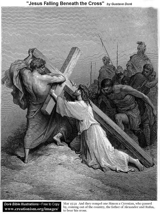
4. For reference: Gustav Doré’s Jesus Falls Under the Cross.
It helps to see what he was seeing… but not copying. Studying. Feeling. Reimagining.
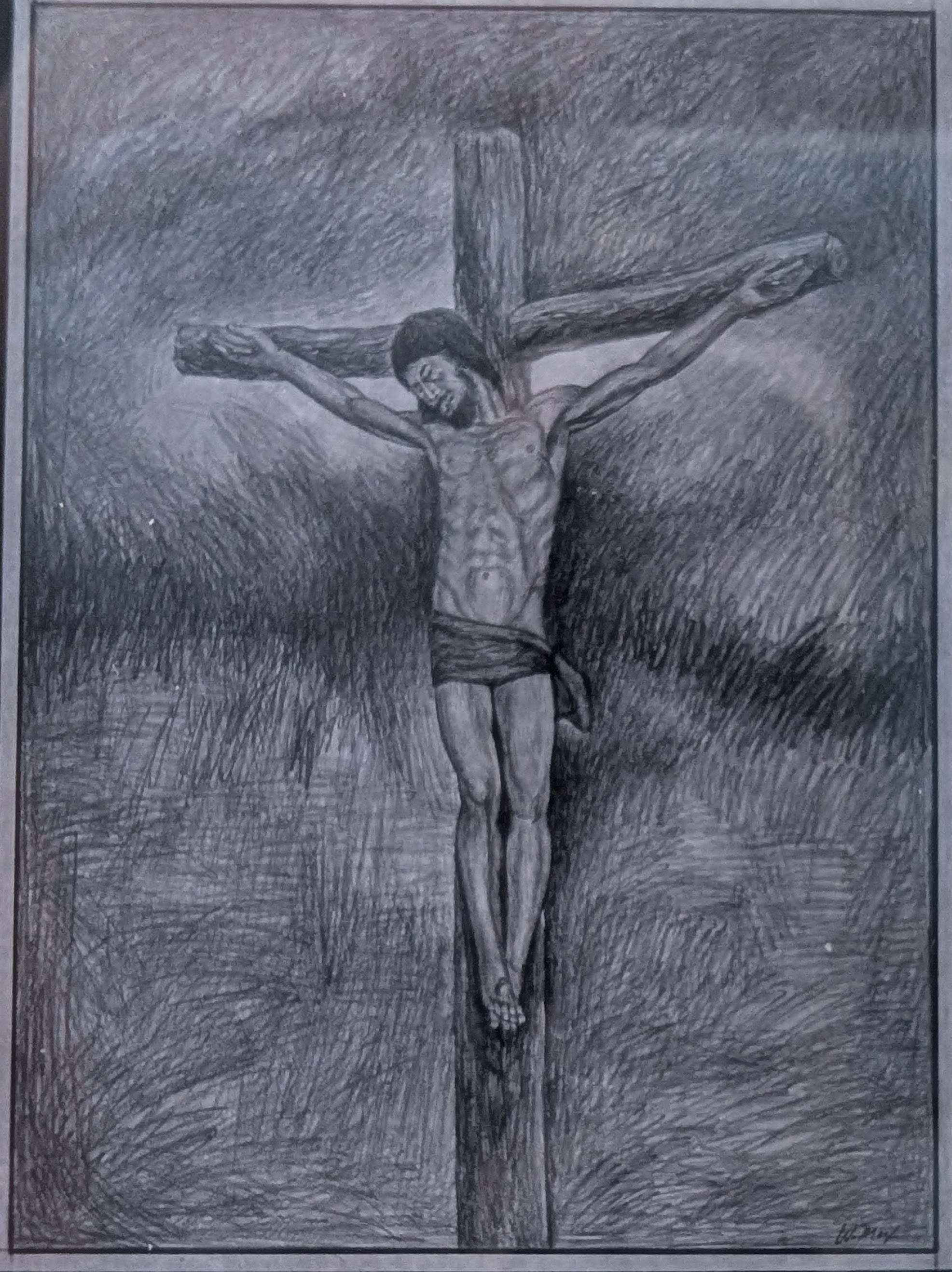
5. A simpler drawing of Jesus on the cross. The wood is cylindrical, almost tree-like. No squared beams. Just logs, raw and rounded. Jesus’ head hangs down. Feet nailed together. It's quiet and deeply human.
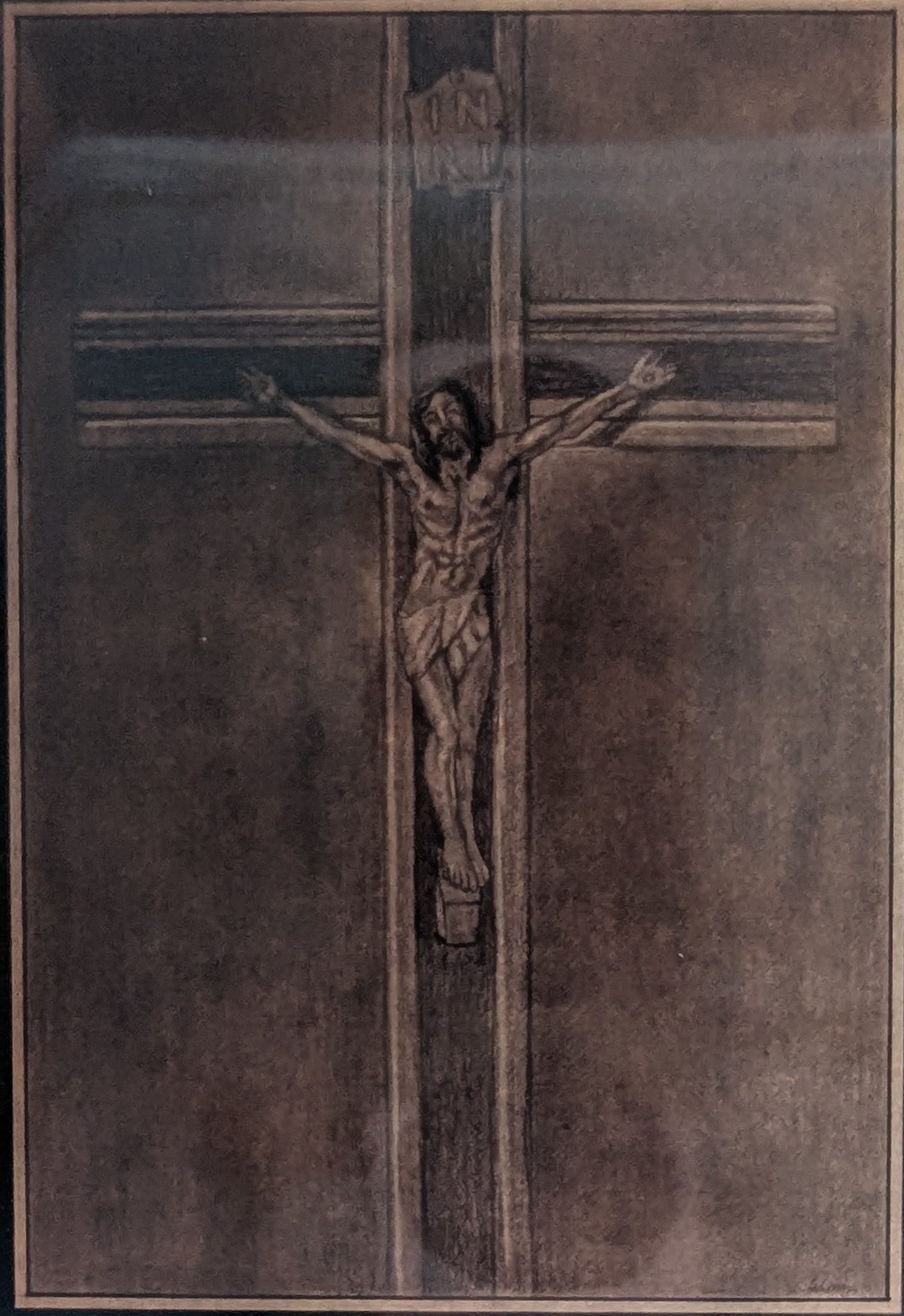
6. A sketch of the crucifix my father kept in his studio — now resting on the box that holds his ashes.
Jesus, lifelike and alert, eyes still open. Perhaps what is some linen above him marked INRI, but arranged vertically — “I N” over “R I”.
According to the New Testament, this was the inscription Pontius Pilate had placed above Jesus on the cross. It’s a common detail in crucifixion art — sometimes rendered horizontally, sometimes stacked vertically.
INRI stands for the Latin phrase:
"Iesus Nazarenus, Rex Iudaeorum"
which translates to:
"Jesus of Nazareth, King of the Jews."
In this drawing at Jesus’ feet, a slanted wooden block seems to support him. A small shift in posture that changes everything. Even though I recognize this drawing to be one of my father’s crucifix about the size of his hand he kept around his studio, the depiction of Jesus here seems very lifelike and realistic compared to the inanimate object I assume inspired this drawing.
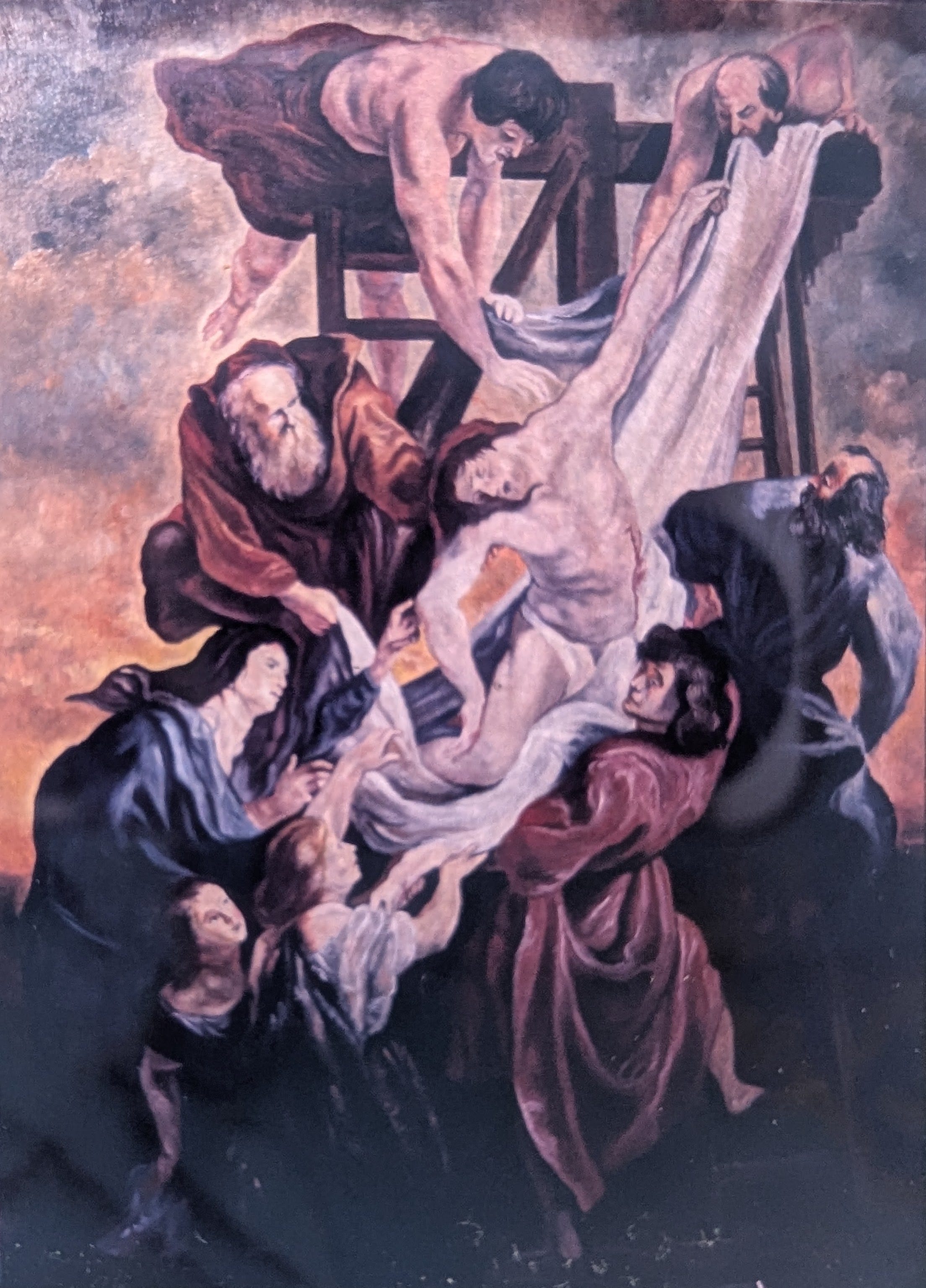
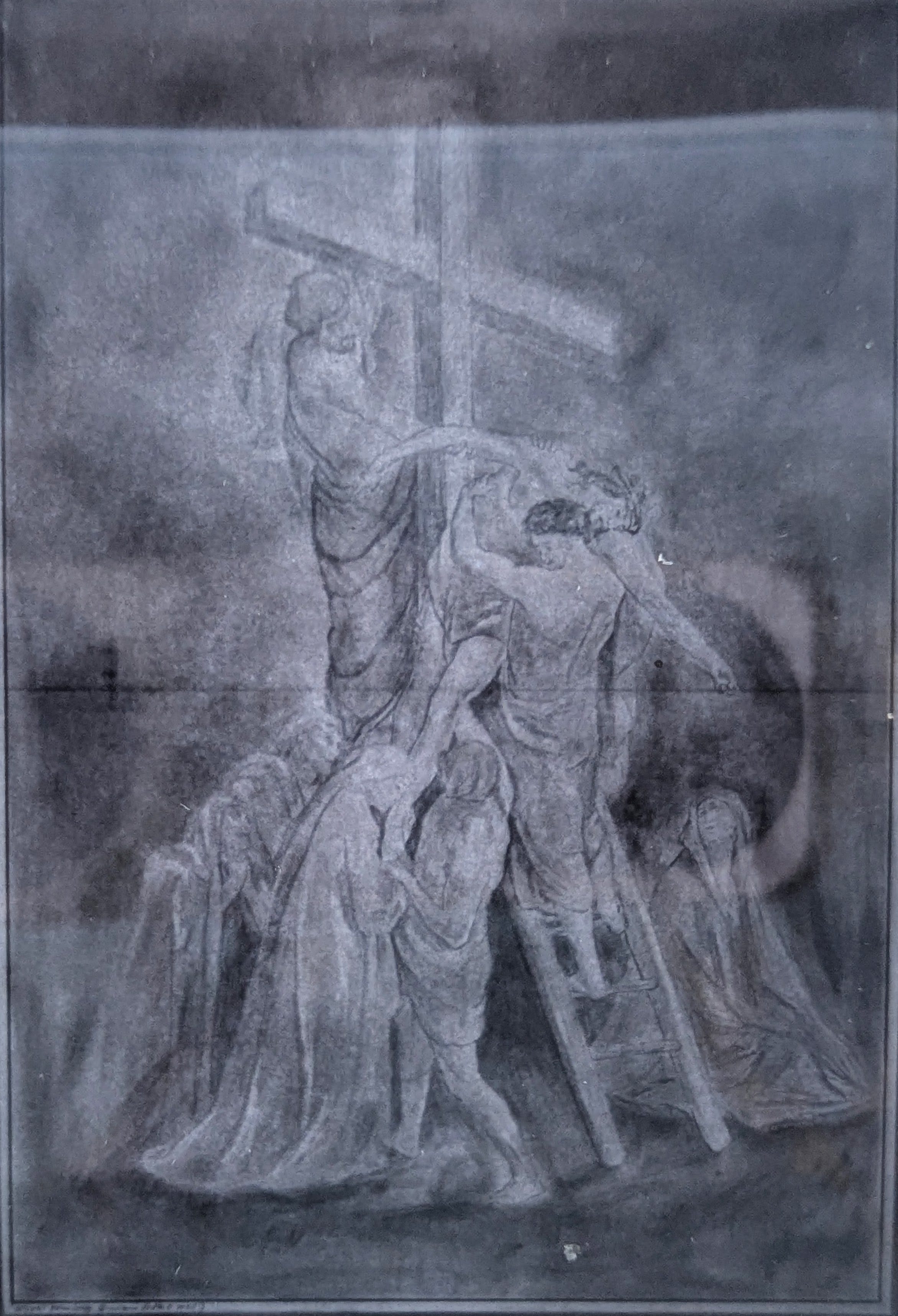
7–10. A study of Rubens’ Descent from the Cross. My father’s full rendition — solemn and theatrical — shows the entire composition. It’s clearly a tribute, but not without divergence. He was absorbing, yes, but also reshaping:
11. A linked video: an art historian’s analysis of Rubens’ Descent. A reference point for context:
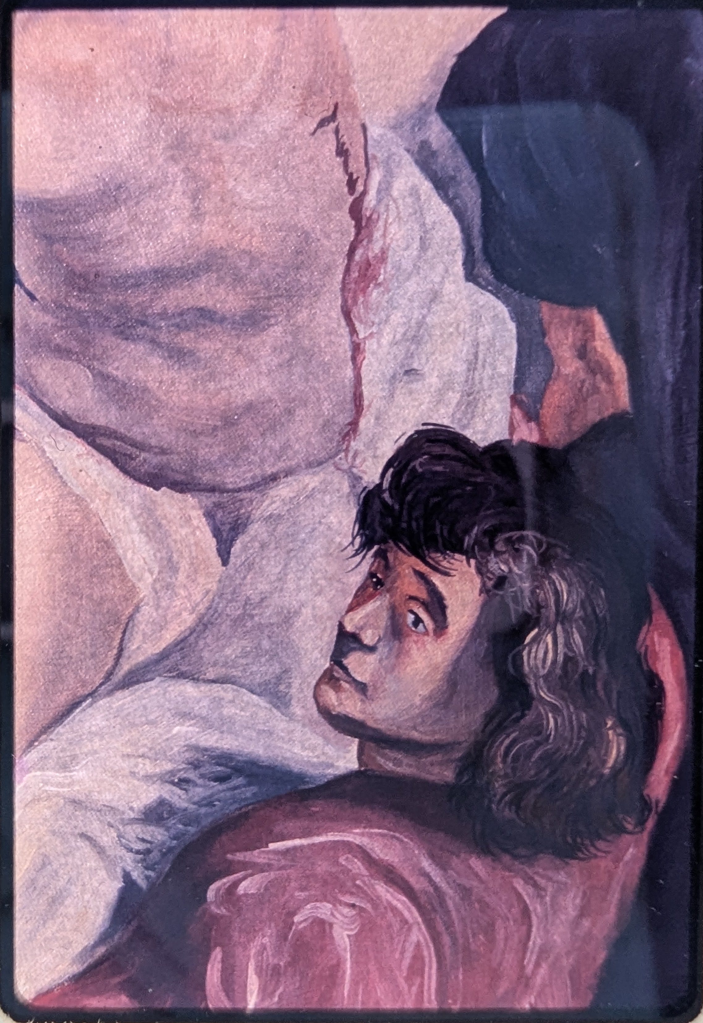
12. A slide purposefully zoomed in on Jesus’ body and the woman beneath him. He did not often carry this process out for slides of his other paintings.
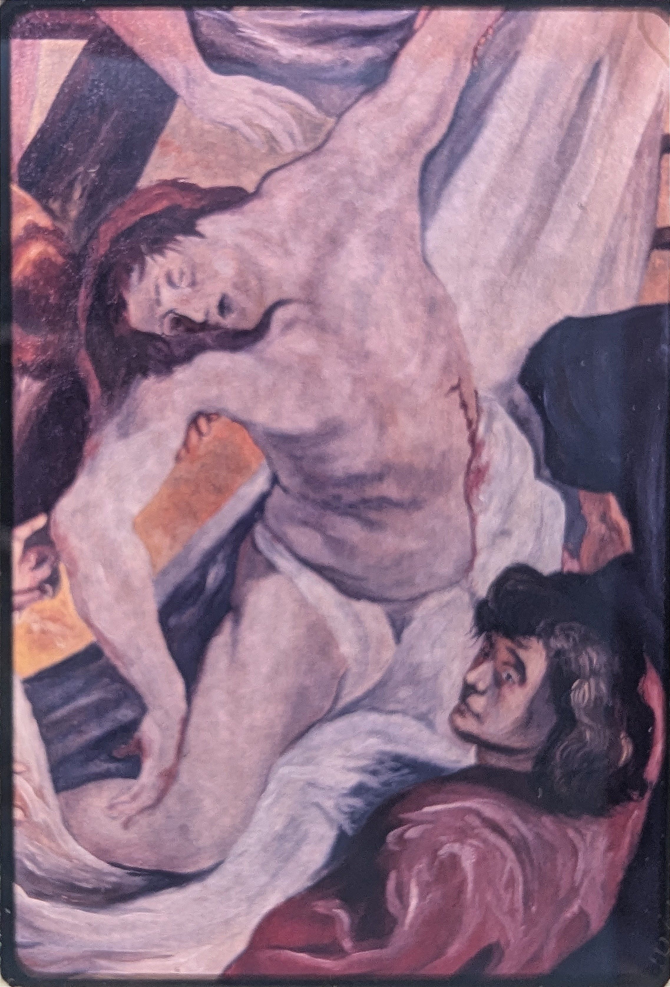
13. A deeper close-up of that same woman’s face.
The expression, the eyes, the profile, her hair, the clothes at her shoulder— I don’t have the words. I just keep looking. Her face is not Rubens’. It’s uniquely my father’s. An original vision placed within a borrowed framework.
14. One last drawing. Blurry. A different version of the descent.
I’m not sure if it’s original or adapted. Could be Doré again or it could be entirely his own from all the studies running through his mind. Either way, it belongs here:
This post feels more like a pause than a narrative. These images weren’t meant to be viewed this way — not backlit through windowpanes and filtered by paper and phone glass. But maybe this is how they survive for now. Through light. Through intention. Through me.
Blessings, everyone.
All the Love,
One True Artist’s Daughter,
Colleen Noelle